Edward Hopper (1882 – 1967) was an American realist painter, depicting both landscapes and social situations. Some of his most well-known paintings are Nighthawks [1943] and Automat [1927]. His paintings are often said to portray people’s social isolation and loneliness, and even his landscape paintings feel desolate. Hopper’s paintings also inspired numerous filmmakers, for example, Alfred Hitchcock drew inspiration from Hopper’s House by the Railroad [1925] to make his film Psycho [1960] and Ridley Scott purposively wanted his film Blade Runner [1982] to have the atmosphere of Hopper’s Nighthawks. Below I discuss four other works by this interesting painter.
I. New York Movie [1939]
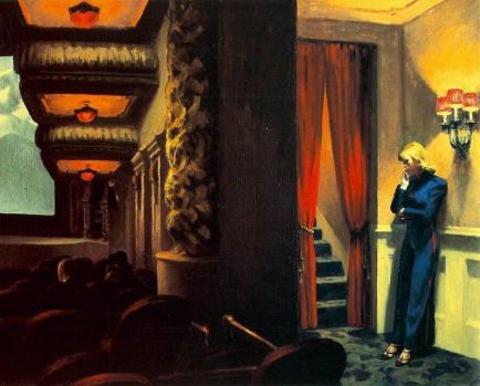
In this painting by Edward Hopper, the female movie theatre usher is standing in the hallway, consumed in her own thoughts, waiting for the movie to end so she can resume her duties. Inside, people are engrossed in a film that shows a mountain range (an exotic place). Subtly, Hopper may try to satirise the movie-going experience. We are made to believe that what we see on screen is the “real life”, which is exciting and full of action and adventure, but, in fact, the “real life” is in the hallway – still, and probably wrecked with doubts and everyday worries. Although just some metres separate the usher from the audience, we still detect a lot of (psychological) distance between them when looking at this painting. The usherette feels isolated and alone. She is seen standing and bathed in light from the lamp, while the audience is sitting in the dark. Light, often being the metaphor for truth and knowledge, may also hint to us in this picture who is experiencing an illusion and who is closer to reality.
II. Office in a Small City [1953]

In this painting, Hopper wanted to give the sense of “an isolated and lonely office interior rather high in the air”. We see here a solitary office worker who gazes in the distance through a window. Even though the windows are very big and we see blue skies, paradoxically, the feeling is also one of claustrophobia because we are looking at the sitting man through a two-windows perspective, which still emphasises white walls. The man’s solitary and lonely nature is further stressed by the fact that so much of this painting is taken by the white concrete, while the man seems to be much smaller and distracted from his activity, day-dreaming. Even though his work is supposed to project “office-business” and a hectic activity, it projects the opposite: loneliness and boredom under the glaring sun coming from the windows.
III. Room in New York [1940]

This image will definitely not be an advertisement of “a couple’s happiness”. Hopper let us see through the window at this couple’s evening activities. One interpretation is the feeling of isolation and loneliness which these two people experience. It is paradoxical because a mere metre seems to separate the couple. Yet, the man and the woman are not interacting and doing their own activity, while, probably, being preoccupied with their own thoughts. The feeling of isolation is further stressed by the fact that the couple is not facing each other and there are colour differences between their skin and clothes, giving the feeling of them being very different people. The feelings of boredom that they experience can be seen in the fact that the man is holding a newspaper, an activity (reading) which he probably had already done much at work during the day and does not really have to do now to relax. The woman’s position at the piano also signals her weariness: she sits sideways at the piano, as though she is not very interested in playing it and just wants to pass moments at it out of boredom.
Another interpretation is that this may be the image of “solitary contentment” – each of these people are consumed in their own activity, but it may not signal loneliness, or the inability or unwillingness to talk to each other. They are relaxing in their proximity to each other, but doing their own activity.
IV. Gas [1940]

In this picture, it is evening, one attendant is at his gas station and no one is around. As Office in a Small City above, the feeling is one of loneliness or isolation because a lot of this picture is taken by nature and man-made buildings. This also stresses the insignificance of the man in comparison to the wider world. Although a gas station is supposed to be “useful” and “accommodating”, the sense when looking at this picture is one of futility. This is further emphasised by the fact that the road in this painting seems to lead further into the forest, where there will be minimal, if any, vehicle-activity. Civilisation and nature do not seem to correspond well with each other in this painting, and, even though the gas station has very bright lights and emphasises the colour red, these only signal its forced artificiality and do not help to attract late-coming visitors.

Thank you for sharing these works
LikeLiked by 1 person
I love it when you discuss art (paintings, etc.), as I know next to nothing about it. Thanks.
LikeLiked by 1 person
Thank you for reading!
LikeLike
One of my favourite artists. I didn’t know that he had inspired those film makers. Very interesting. Thank you.
LikeLiked by 1 person
Great post! I especially love the paintings “Office” and “Gas”. It struck me that the human figures here are situated mostly in the periphery, or else are made to look like part of the setting rather than being the subjects, which could perhaps contribute to the sense of isolation these artworks produce. It’s curious that looking at these paintings make me feel melancholy but also simultaneously opens up space inside. Also, it’s a very timely post. Thank you for sharing!
LikeLiked by 1 person
Thank you for reading! I agree with your assessment. The people in “Office” and “Gas” are presented as though there is nothing special about them at all and they are not worthy of a bigger spotlight – there is a sense that they have been “absorbed” by their environment, which may be Hopper’s way of saying that they are now in service of a new technology/progress/work environment which robs them of their identity and leads them to nowhere.
LikeLiked by 1 person
“Absorb” is a very good way to put it! I wonder though about why, if his paintings have such a bleak interpretation, the colors in them are so vibrant. I’m not well versed in art but color always seem to suggest hopefulness to me. What do you think is the function of these colors in his paintings?
LikeLiked by 1 person
Yes, I guess colour and light are what make Hopper’s paintings so unusual and vivid in their intensity – also paradoxical because of some subject matter. I am not any expert on art either, but I think colour is what gives his paintings “life” when otherwise there will be virtually none because the people he portrays are often compared to mannequins and the like.
I cannot say for all of these paintings, but, my feeling is that bright colours are also there to contrast or to draw attention – such as to emphasise the difference between the people in the painting, as in the first picture New York Movie (between the audience and the usher), or between the couple in the third picture (so we immediately see their differences and “uncoupling” even though they are very close to each other). And, in Gas, as I said above I guess, to also draw attention to the industrial progress – petrol pump – which is coloured red, and away from the man next to it (as you also said). This may be obvious, but it is just me thinking aloud and, given Hopper’s previous work in advertising, I guess bright banners and glossy covers that capture attention immediately were never far from his mind too when he painted these images.
LikeLiked by 1 person
Thanks for the thoughtful response. I like your theory about color to present contrast, especially for the “uncoupling” one. Given what you said about his background in advertising it can also be likely that he presents an environment vibrant with progress but with human beings left behind. In any case, the contrast is very striking. I love these paintings; thanks for sharing!
LikeLiked by 1 person
Beautiful artwork and interpretations. I particularly like “gas” but find all the paintings beautiful and symbolic.
LikeLiked by 1 person
Thank you for reading! Even though I put “Gas” last, it is also probably my favourite of the four, closely followed by “New York Movie”.
LikeLiked by 1 person
That’s great too, they are call amazing!
LikeLiked by 1 person
Thanks for sharing! I miss going to art galleries and museums 😦 Office in a Small City is amazing, I could keep looking at it for hours…
LikeLiked by 1 person
I agree that there is something entrancing about “Office in a Small City”. We are shown one view there only through the room and it is like we are being invited to share this moment with the solitary office worker. I read somewhere that Hopper spent ages on composition, figuring out how to present his ideas in the best possible way. I guess that effort paid off.
LikeLiked by 1 person
Such a well written post! Thank you.
LikeLiked by 1 person
Enjoyed this! Thanks for sharing.
LikeLiked by 1 person
This is an extremely interesting post, Diana. Your commentary is incisive and very illuminating.
I discuss Edward Hopper in my post:
New York sunlight (and New York joys)
at
https://rogersgleanings.com/2018/07/08/new-york-sunlight-and-new-york-joys/
where I comment that my late friend from New York, Bill Dalzell:
“introduced me to the paintings of Edward Hopper, one of his favorite painters. (Hopper’s paintings are, for the most part, exhibited in New York museums.) Bill and I, at his suggestion, made a one-day excursion to Nyack, NY to view Hopper’s birthplace.
“During our museum trips, he pointed out how Hopper made use of light.
“ ‘The light is different in America,” Bill would say. … By “different,” Bill meant brighter. More brilliant. Yes. Brilliant light. An observation which I do believe to be true. I have observed and thought about this often.
“I have come over the years to be myself fascinated by light. Early morning light, daylight, late afternoon light. The light hitting the grass. Different shades of light and degrees of brightness. Summer light. Autumn light. Winter light.”
Edward Hopper has long been a favorite of mine. I have visited his boyhood home in Nyack, New York.
I didn’t know about Hopper until I came to New York City as a young man and received my real education. I often went to the Whitney Museum (often with my friend Bill), which had most of Hopper’s paintings.
LikeLiked by 1 person
Thank you! I appreciate light in Hopper’s paintings and agree that light in the US is different from anywhere else. Now that I think about it, I do recognise that one thing that makes Hopper’s paintings so great is his effective depiction of light/shadows. It is also my dream to visit Hopper’s childhood home in Nyack (I have seen your picture of it and it looks wonderful). I hope in future to visit the Whitney Museum and the Met to see some of his paintings, thanks for the recommendation.
I have heard somewhere that the art of proper illumination and lighting is already a lost art in Hollywood – since Hopper’s paintings remain inspirational for filmmakers, I do hope they continue to be so for many years to come since it seems that I am a big fan of all movies that drew inspiration from his art, including Sam Mendes’ Revolutionary Road.
LikeLiked by 1 person
I love his paintings!
LikeLiked by 1 person
What a coincidence! I just finished writing an ekphrastic poem about Hopper’s “Lighthouse at Two Lights,” a print of which hangs on my living room wall above the couch. Several months ago, I had an opportunity to see his last painting, “The Final Curtain” on display at a local museum. Hopper is one of my favorite artists.
LikeLiked by 1 person
Coincidence indeed! “The Lighthouse at Two Lights” is a wonderful painting, too. It is great to hear that you had the opportunity to see “The Final Curtain”. I like it a lot, though I am finding something a tiny bit unnerving about it as well and I don’t even know why. I certainly appreciate Hopper’s very own minimalism.
LikeLiked by 1 person
I agree that there is something unnerving about “The Final Curtain.” Maybe it’s the smallness of the white figures against the vast blackness behind them?
LikeLiked by 1 person
Possibly.
LikeLiked by 1 person
On the other hand, I do take great pleasure in the fact that some works of art defy explication.
LikeLiked by 1 person
Great post! I really like Edward Hopper paintings. Nighthawks is, predictably, my favorite, but I always enjoy seeing his work. Office in a Small City and Gas are familiar to me from the examples you’ve given. In a “translation in fiction” class I took in college we mostly read things translated from one medium of art to another (rather than between languages), and one of them was a book of short fiction (or perhaps prose poems??) based on Edward Hopper paintings, and I loved it! I cannot for the life of me remember who wrote it or what it was called, which is frustrating, but it struck me as a very interesting project and I’ve enjoyed Hopper’s work ever since. Actually, part of what I liked about reading the book for this class is that the images didn’t accompany the stories, the teacher handed them out separately and we had to match them up ourselves. It was a lot of fun seeing which images “obviously” went with which stories, and which were harder to match to their corresponding fiction pieces.
LikeLiked by 1 person
Thank you! That must have been an interesting task matching Hopper’s paintings to poems, and I am generally very interested in how art inspires literature. I think there is much more inspiration between the two than we generally assume – authors have to draw inspiration from somewhere, and music and art are obvious choices. It would be nice to know what book was that that you read in class, I am so curious, I think I will search for it, thanks!
LikeLiked by 1 person
I tracked down my copy! It’s Edward Hopper: Poems, by Ernest Farres. It is indeed a translated work, from the Catalan language, and both languages are included in the book. I did not remember that, since my class only focused on the English, but I really liked what I read. It was a great class that really opened my eyes to how art can move across mediums, I would not have considered that a part of “translating” fiction otherwise. Of course books to films is a common case, but we also looked at turning poems into longer form fiction, turning music into fiction, turning pop culture lingo into phrases with literal translation, etc. Lots of art informing art that I didn’t even realize was happening! It definitely widened my perspective on where inspiration can come from and how very many forms it can take. I hope you find the Edward Hopper book as interesting as I did if you can locate a copy! It looked on Goodreads like there might be more examples of fiction pieces inspired by EH paintings as well, I might look into that.
LikeLiked by 1 person
Thank you! I will definitely try to locate it now and read it. It sounds very interesting!
LikeLiked by 1 person
This is so interesting, thank you – I recently watched Hitchcocks’ Double Indemnity and then went to a modernism exhibition – the two work so well together!
LikeLiked by 1 person
hi, Jane … “Double Indemnity” was directed by Billy Wilder, not Alfred Hitchcock
LikeLike
I absolutely love Hopper’s art – thank you for this timely post, it is eerie how much his paintings resonate with our social distancing and the pervading sense of solitariness.
LikeLiked by 1 person
Had thought until now just how relevant Hopper is to the current climate. Poignant stuff.
LikeLiked by 1 person
Correction: “Hadn’t.”
LikeLiked by 1 person